Showing posts with label Assignment. Show all posts

Saturday, 12 July 2014

Assignment 5: Response to Tutor Comments

I was extremely relieved that this assignment was favourably received, as I mentioned in my commentary I felt very much out on a limb here and I am reassured that Keith thinks I am on the right path. On his suggestion I have altered the positioning of some of the images, changed the font and centred the text more (revised images are shown below) . How the images would be presented was a consideration for me throughout the assignment. In my minds eye I imagined both pictures printed at 4x6 on opposite pages of a photo album. For assessment I have had the images printed side by side on A4 size paper, with hindsight I maybe should have followed through with my initial concept as presenting in a photo album would change the reading of the images considerably as it would express my intentions more fully and gain strength by becoming an artefact rather than a series of images.


Looking back on the course this last assignment feels light years away from the work I put together for the first assignment and I think demonstrates how I am now more able to take risks with my work. I am starting to think less like a student and more like an artist, I am less worried about failing and more driven to create and express myself. The assignment has given me the confidence to continue  experimenting and to try and push myself out of my comfort zone  whenever possible. I feel positive about my future studies and can see now the aim is to create an independent and sustainable practice.


Friday, 4 July 2014

Assignment 4: Response to Tutor Comments

The first section of Keith's feedback which draws attention to the work of Nick Ut, Dorothea Lange and Robert Capa threw me straight away and I quickly realised I had missed an opportunity with this assignment. These are all documentary photographers and Keith makes valid points about how cropping, perhaps the simplest form of photographic manipulation, can greatly alter how we read a photograph and our perception of the truth it contains.


I was pleased Keith appreciated me citing Morrissey as an influence as one of my reasons for including him is that he had, and continues to have a keen interest in how is worked is packaged and the images that are used to present his work. I think Keith recognises that I did not have the courage of my convictions here to discuss the work further. This explains my very technical approach to the assignment, I think I focussed too much on design rather than exploring the notion of photography and truth. Keith makes pleasing comments about my ascetic choices for the cover design but I feel somewhat disappointed with myself here as I have played safe and not stretched myself to move forward; I have stayed too much in my comfort zone. If I was to complete this assignment again I think I would pursue I more purely photographic approach and try to produce a cover in the style of an artist with a strong visual identity like Morrissey. 

Assignment 5 - Tutor Comments

Overall Comments

Many thanks for submitting this last assignment Michael, which I thought was a very touching and worthwhile project.

Key issues mentioned in my last report are as follows:

  • Look at the work of Nick Ut / Dorothea Lange / Robert Capa

Feedback on assignment

I really liked the Barthes quote that you opened with here and a book by Keith Jenkins immediately sprung to mind.  I have listed it below and although it isn’t strictly photographic  … I think you might get something from this.  Jenkins goes on to highlight the fact that ‘History’ and ‘The Past’ are two entirely different things, and can be interpreted differently depending upon who is reading them.  The past has already happened and can never happen again … whereas History, through writings etc, is an attempt to bring it back by the historians / theorists / academics etc.  Jenkins carefully differentiates between the two.

I really liked this project from start to finish and thought there was a real purpose to it.  It can often be very difficult for undergraduates to grasp the fact that this medium is about so much more than just one off slick images.  I liked the fact you have used ‘found’ images, sourced from your family archive – this is a creative milestone in my opinion.  I also thought the presentation worked well in terms of the duplicated reflection, with the opacity reduced.  The text could have been ‘designed’ a little more perhaps … in terms of font  / size / page justification / positioning etc … but the content was very reflective and moving at times.  The fact you have chosen to tackle this project in such a way leads me to believe you are definitely heading in the right direction in terms of your development critically. Take a look at Tacita Dean’s project called ‘Floh’.

I’d also like you to look at the work listed below by a British photographer called Julian Germain.  He was in residence at the National Media Museum a few years back and for the ‘Every Minute ….’ project, he spent a number of years photographing a man called Charles Snelling.  The images have been shot with a large format camera and really enter into the personal life of this fascinating subject.  It shows that a chance encounter with somebody can lead to the development of both a relationship and output of a body of work over an extended period.

Lastly, I would also recommend reading the Photography, History & Memory publication listed below … here is a short quote which might attract your curiosity !

Once a photograph comes out of storage, it is as if ‘energy’ is released. (Hayes, Silvester, Hartmann, 1999)

Learning Logs/Critical essays


Again, this is working well … the only thing I would suggest here is the possibility of making navigation a little more straight forward.  It does seem a little chronological at the moment.

Assignment 4 - Tutor Comments

Overall Comments

Many thanks for submitting this assignment Michael, the imagery and contextualization for which worked well in my opinion.

Key issues mentioned in my last report are as follows:

  • Look at the work of Evans / Joshua Cooper / Davis
  • Further research the term ‘Genus Loci’ and in particular its application within photographic practice.
  • Continue to read around the subject matter and cite academic reference.

Within the broader photographic consideration of the terms ‘real’ and ‘fake’, I normally suggest to my students to take a look at this image taken by Nick Ut in Trang Bang village just outside Saigon, Vietnam in 1972 [see below].  It is a very famous image that has been seen all around the world and has been used on various front covers of magazines etc [Time 1972].  It depicts the young nine year old girl Kim Phuc, running towards the camera after a Napalm attack on her village by the US forces … another example of friendly fire as the villagers were allied Southern Vietnamese and not part of the North Viet Cong fighters.  The image is full of all the harrowing impact expected to be found in war imagery and has lost none of its initial impact over the past 40 years since it was taken.  There was also some moving image footage taken of exactly the same event at the same time, but this fails to have the impact of the stills shot which has literally caught the moment in time.  The reason I bring this image to your attention is that the original image was cropped slighted on the right hand side.  We now know that this was shot on 35mm monochrome film and therefore the format of the shot is slightly more square than it should be for a full frame 35mm image.  What was excluded from the shot was a soldier at the side of the road loading a film into a camera – which when included completely reduces the overall impact of the image as the question is asked why he was not in assistance etc.  He was removed to add impact.


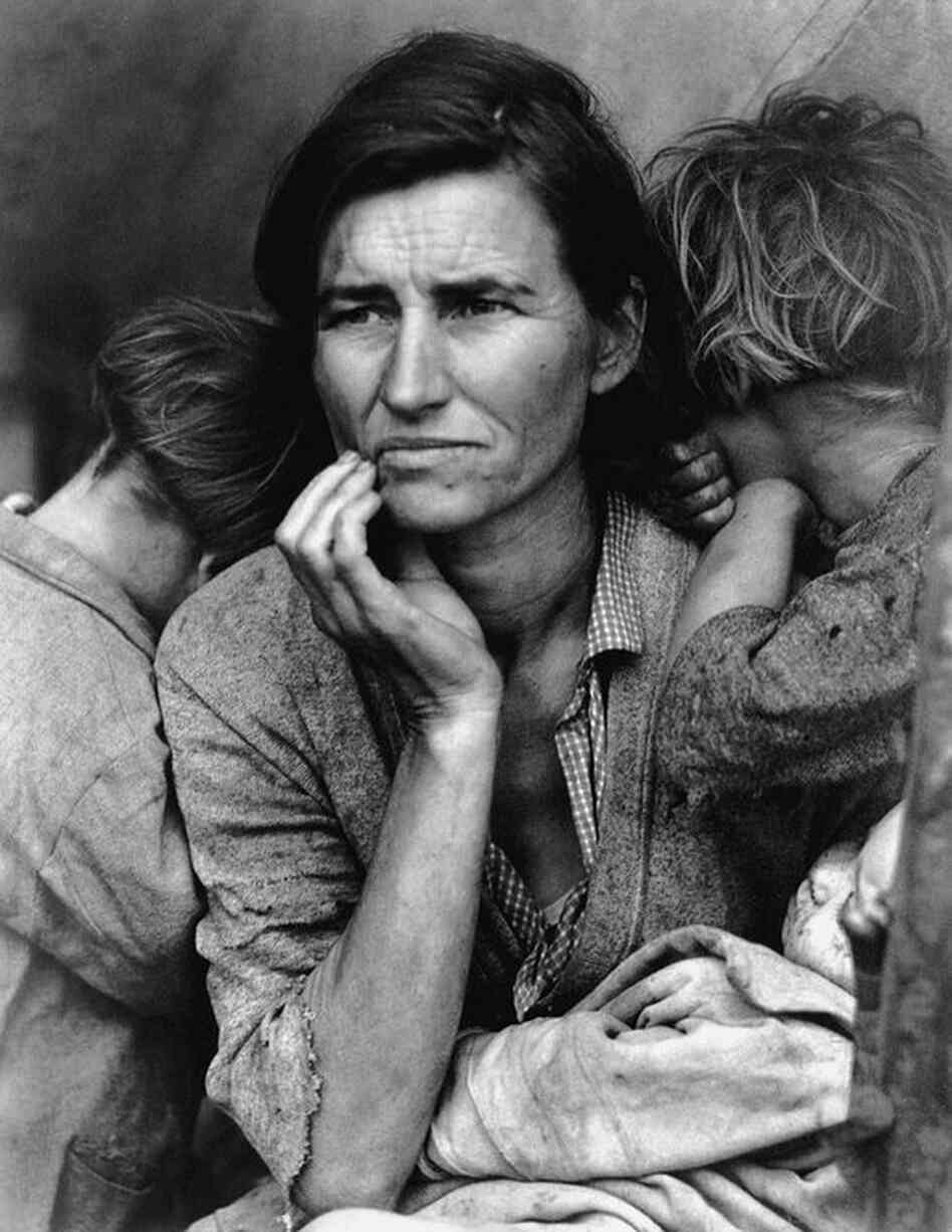
There is also a similar debate raised with an image taken by a photographer called Dorothea Lange, who took photographs for the American Farm Security Administration [FSA] in the 1930’s.  This image has been called ‘Migrant Mother’ and is also pictured below – the debate was about a ‘thumb’ that had been printed out of the bottom right hand corner, suggesting somebody was ‘revealing’ the family from behind the side of the tent and therefore staging the shot. 


It might also be worth reading about Robert Capa’s ‘Death of a Spanish Militiaman’ taken in 1936.  These are all healthy arguments still raging within photographic debate in relation to image manipulation and could be elaborated upon within your blog.

Feedback on assignment

From the outset I was impressed with the fact you had mentioned Morrissey in your initial research, as his attention to detail in terms of packaging his creative output was inspirational to an entire generation.  It may also have been an idea to have shown some visuals here of specifics in relation to these covers … including any critical opinions sourced and your own thoughts etc.

Both Cover A and Cover B are fair attempts and your intention to keep the cover as simple as possible was evident in both.  I think in this respect Cover B worked better and was actually quite convincing. I was also very happy to observe the attention you had given to the use of text on the image, which again worked better in Cover B in my opinion.  This is something that is often overlooked with this exercise or certainly placed at the bottom of the list.  The 30% / 60% is a good rule of thumb and the title sat well on the box at the bottom of the image – even the colour of the type face looked correct as if it had been directly sourced from the original matchbox.  As a technical exercise I think you have learnt from this assignment, which will become helpful in the future.  There is an assignment at level HE5 which requires students to actually produce an illustration of one of a series of titles including Perfume / The Diceman / The Outsiders / 1984 etc … which students find very challenging – you could almost view this attempt as a precursor to that assignment.

Learning Logs/Critical essays

This is proving to be a good vehicle for evidencing the development of ideas and generation of research and testing.  There is plenty of practitioner research being conducted and reviews of exhibitions etc.  Also … you may want to remove any evidence of the use of Wikipedia as source of reference, if this applies.

As mentioned above, you’ll also need to include books / literature / journals / magazines as source of research prior to submission for assessment.

Thursday, 12 June 2014

Assignment 5: Personal Project

“What the Photograph reproduces to infinity has occurred only once: the Photograph mechanically repeats what could never be repeated existentially.” 
Roland Barthes, 'Camera Lucida: Reflections on Photography'

Unlike other assignments, notably assignment 2, I have known for a long time what subject I would tackle for the final assignment of the course. I was inspired by an article in the March 2013 edition of 'The British Journal of Photography' about photography in children's books particularly reading about Alec Soth and his collaborations with his own children. I thought this would be a fun way to end the course to do this myself and for months have talked to my three children about producing a story book together. We discussed the story, the look and I encouraged them to write scripts and story board. Then at the time we started shooting the images and experimenting with Photoshop things changed because my Grandmother passed away suddenly.

The practicalities of dealing with a family members death took up the majority of my spare time and I was not in the right frame of mind to work on the storybook. On an evening I found myself thinking through memories of my Grandmother and considering the relationship we had. I had been asked to speak at the funeral and was finding coming up with something extremely difficult, I found myself facing complex emotions when thinking about my grandmother, not all of them positive and this played heavily on me. I started looking through old photographs on my computer which dated back as far as 2002 when I got my first digital camera. I started looking for prints from earlier than this but could not put my hand on any although I knew they packed away in the house somewhere. I asked my mother to do the same and she had a similar problem, however, she did manage to find around 50 prints and I found myself viewing these in a much different way now that my grandmother had passed. The photographs carried an emotional charge for me and I found myself drawn to images that I probably would have discounted earlier. The majority of pictures were 'badly' composed or had exposure problems, I found myself looking closer at a number of pictures on my computer that had not made it into my selects when I first edited them. Why was this? Was it because I was looking at the photographs through the prism of grief or had my way of seeing altered in recent months? I was certainly aware that I was becoming more interested in less conventional approaches to image making but how much of an effect had this had on me? Typical with family snapshots a lot of the images were posed and taken on special occasions - birthdays, Christmas, weddings. I realised that I was attracted to the more natural looking pictures, they seemed to show more truth (as I understood it) because often the people in them were unaware of being photographed or had not been given time to put up there defences, pose and smile.

In a strange coincidence I had also recently finished reading Roland Barthes 'Camera Lucida' after being encouraged to do so by my tutor. The book had sat on my shelf for some time and I had mentioned to my tutor that I was trying to build up the courage to tackle it, his comment was that although Barthes could be "prickly" in places it was worth persevering with. My first impression was that the book was much different than I expected - I did not think the tone would be so personal and I found myself engaged. The writing felt accessible but poetic and dense at the same time. Sometimes I found myself understanding exactly what Barthes was asserting and at others I was perplexed. I realised quickly that the book was something I would need to come back to many times again to gain a complete understanding and allowed the words to seep over me. The sections that deal with the death of Barthes mother and his search for her essence in old photographs struck a chord with me but I did not expect to be doing the same thing myself - not that I did this with images of my Grandma in a conscious way, it just seemed to happen. Without really realising what I was doing I had collected a number of images together, I found the process comforting. I then began to wonder if I would do anything with the pictures, I would probably have some new prints made I thought. I cannot exactly remember when I decided I would use some of these images for this assignment rather than make the photobook with my children that I had long planned to do. It just suddenly seemed like the right thing to do - I felt compelled to produce something, maybe it was the feeling that the act of doing this would be some sort of catharsis. As I have discussed throughout the course, particularly in relation to assignments, I am often full of self doubt and have to really push myself at times to produce the work for the course. I would say I am a private person and certainly not someone that would turn the camera on themselves in the way Nan Goldin does, certainly none of the work I have produced for any of my OCA courses has been about me, and here I was about to produce something completely personal without a shred of self doubt - quite the opposite, I would say I was compelled to do it.

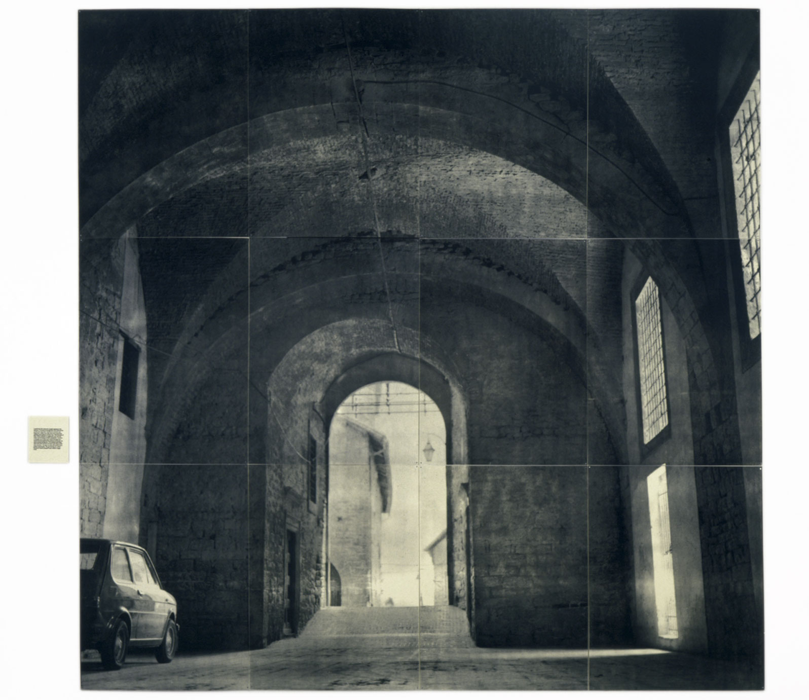
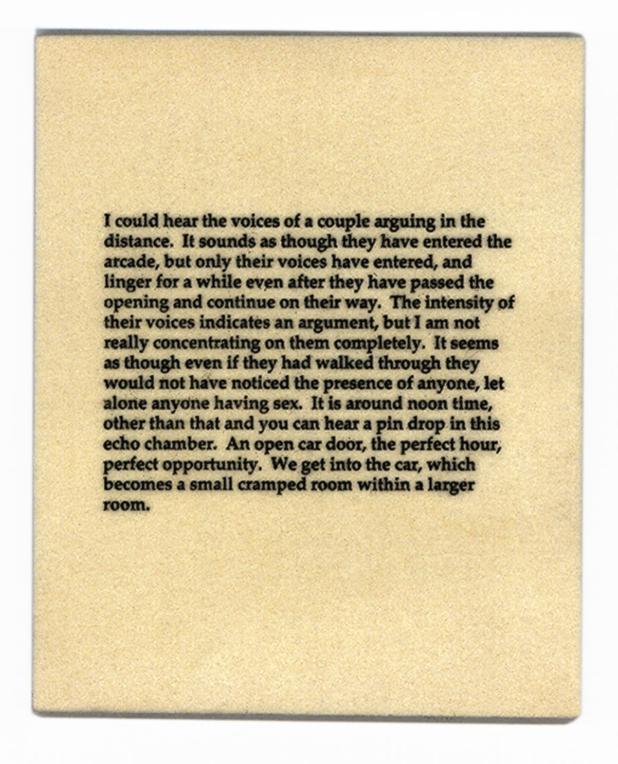
I remembered about 'The Dad Project'  by Briony Campbell which was a work that had a tremendous effect on me when I came across it some time ago. I identified with it because I went through a similar situation watching my Grandfather slowly die six years ago. The thing that impressed me most was how personal the piece was and how Campbell used the project to deal with the grief of her father dying from cancer. The project is harrowing and does not shy from the grim reality of the situation and yet is also uplifting. The final image is of Campbell as a child wearing her Dad's coat, shoes and hat and is a poignant and fitting conclusion. The captions work in harmony with the images and read more like diary entries rather than explanations of what is happening in the photographs which is fitting since the piece is in itself a diary of her Dad dying. My opinion of captioning images has been changing of late, previously I believed captions should be brief and not influence the viewer into how they should read and image. Now I am beginning to understand how words can and images can work together to enrich the viewing experience rather than detract. I recently visited an exhibition by Lorna Simpson and who uses writing extensively in her work to great effect, the words do not lead the viewer about what to think but rather enable you to question what it is you are viewing. For example, one work 'The Car' (1995) the reading of the piece is transformed by the words which accompany it, the scene changes from a seemingly innocent even boring view to take on a charged, illicit and seedy feel.

So now I had an idea of what I wanted to do, I photographed the prints I had been given by my mother and began the selection process. Unlike other times when I have selected images I was unconcerned about composition and exposure, in fact, in hindsight I probably selected some images because they were issues with them. My only guide to selection was that something should be in the pictures to prick my attention. I then wrote a short a few sentences to go with each image. I did not really know what I would write but I found the process to happen quickly and organically, some words were from the eulogy others were thoughts I had in my mind but had not been able to articulate aloud. I wanted the words to sit alongside the images but when I did this the text seemed at odds with the photographs. Intuitively I copied and flipped the photographs before lowering the opacity by 50% and overlaying the text. For me this adds an element of distance between the viewer and the pictures, you are made aware that what you are  looking at has been selected for a particular effect. Flipping the images is also slightly off putting, I find myself looking between the images and being made explicitly aware that this is a picture I am viewing; a representation rather than a truth.


Finishing writing about this assignment I feel a sense of conflict that on the one hand I am glad this is what I chose to do and on the other I have gone too far out on a limb. It is completely outside of my comfort zone to produce work like this and I doubt I would have been able to do this at any other time because of how close it was to my Grandmas passing. I am shocked at how compelled I was do this and the sense of drive I had - this is not a typical feeling, usually I find bringing everything together a long, drawn out process. And yet, with this project which is deeply personal to me I found the images and words coming together quickly and organically. Truthfully, I am far too close to the subject matter to be objective and I am unsure of how the images will be read. I hope it will be seen as being genuine and heartfelt but worry it is maybe too indulgent and sentimental, Barthes never shows the reader the 'Winter Garden Photograph' the photograph of his mother in which he found her "essence" and discusses at length in 'Camera Lucida' he says, "it exists only for me. For you it would be nothing but an indifferent picture." A sobering thought as I send this assignment in, I guess only time will enable me to look back and decide whether the images here have any meaning for anyone but myself.

Thursday, 1 May 2014

Assignment 4 - Real or Fake?

The brief for this assignment is to create an illustration for a book cover using digital techniques and use this as a means to explore the ethics of image manipulation. Book covers (along with record sleeves and film posters) are something I find of great interest - I love the way a single image can be used to define another art form. Sometimes the approach can explicitly define the contents while at other times the content can be abstract. The well worn cliché 'never judge a book by its cover' can at best be seen as cautionary advice since I doubt such energy would be given to designing book covers if they did not influence sales a great deal; I know I am guilty of buying more than one book because it looks good on the shelf! More importantly for many authors, musicians and film makers however is that the images they choose to represent themselves with can go a long way to define them as artists.


This assignment differs significantly from others because it requires only one image to be produced rather than a set, although this could consist of a composite. My initial research into potential approaches for the assignment led me to a number of interesting articles. In late 2013 the singer Morrissey released his long awaited autobiography after a period of typical controversy when he appeared to have fallen out with publishers Penguin. The exact nature of the dispute was not completely clear but one of the key stumbling points appeared to be Morrissey's insistence that his work be published under the Penguin Classics imprint (Penguin eventually agreed and the book was published.) This stance was ridiculed by many as further proof of Morrissey's tenuous grasp of reality, but others saw this as brave evidence that he was unwilling to accept any compromise on the way his work is presented. Since the early days of The Smiths and continuing through his solo career Morrissey has been obsessive about the way his work is presented. Following the books eventual publication, The Guardian invited readers to produce alternative covers for the book, most of which are humorous and flippant. This led me to my first idea to design an alternative cover in a humorous style.

Another article I came across discussed the effect that the 'Fifty Shades of Grey' trilogy had on publishing. The set of books was a phenomenon that seemed to come from nowhere in 2012. One of the effects of this is that many publishers attempted to cash in on the success by reissuing books with covers that echo the cover of 'Fifty Shades.' Perhaps I could do this too, and maybe create a cover whose style was completely at odds with the content of the book?

Again from The Guardian this article shows a number of real life and extremely ill judged book covers of famous literary works.

I knew from previous experience that the planning and concept stage of assignment preparation can often lead to procrastination and lack of progress. With my course deadline approaching I knew I could not afford any delay, also, the thought of approaching the exercise as if it was a commercial assignment with a definite deadline was one that helped focus my mind. I started to think about books that have had an effect on me and which I already knew a great deal about so would be able to think of an approach quickly.

After scouring my bookshelves I came upon 'Book of Matches' a 1993 poetry collection by Simon Armitage. The book is published by Faber and Faber who unify the style of their poetry collections by using only plain (albeit strongly coloured) covers featuring only the authors name and the title. This seemed like the ideal choice as it is a work I love and also I would be producing the cover without anything to influence me. I knew I wanted to be keeping with the simple style of the existing cover so thought about bold and effective imagery that would complement rather than detract. I decided to try photographing a box of matches as this would provide an interesting counterpoint to the writing and I would also be able to play with literal and metaphorical readings through the image. Looking through my cupboards I found an old matchbox that I thought would fit perfectly because the battered box would echo the themes contained in the book of looking back, the past and nostalgia. I set the matchbox on a plain background and photographed in a number of different ways and angles using a tripod as I wanted to capture as much detail as possible and needed to select a small aperture. At the time of shooting I had a strong preconceived idea of how I wanted the matchbox to look: I would take the shot directly from above to keep the perspective true which would echo the shape of the book. Experience has taught me it is important to keep an open mind and experiment to find the right approach so I shot the box from a number of different angles as well as open and closed so I would have a selection of shots to choose from and could experiment with which one was the most successful. 

I used Photoshop to create the cover, first creating a canvas the exact measurements of the real book. For my first attempt I placed a closed matchbox near the centre of the cover with my intention being that I would put the book title across it and the author name at the top. I quickly aborted this as the approach did not seem right - the final effect was missing the boldness I had preconceived, also, it seemed wrong to have the matchbox shut. I went back and to my shots and chose another image of the matchbox open with the matches showing. I was struck with the idea to make the box the same width as the book cover, this seemed to work well and left me with around half of the cover blank which I decided to could use to place the text in a similar way to the existing cover. Next, I wanted to accentuate the creases and folds of the box along with the texture of the matches so duplicated the image layer and applied hard light blending mode which increased the contrast and saturation of the image. I also needed to remove the background at the top of the box, with hindsight I should have shot the box against a contrasting background as the grey was extremely close to the colour of the box and this would have made it easier to select. In the end I used a layer mask to hide the photographs background so I could go back and edit my selection if necessary once I had added a new background. Next I needed to delete the writing on the box, I did this with the clone stamp tool followed by the healing brush to replace any texture that had been lost. To emphasise the edges of the cardboard a little more I duplicated the layer and changed the blending mode to multiply before adding a layer mask and painting over the edges of the cardboard to emphasise the degraded nature of the card. Lastly I chose the colours, I decided to do this by using the eye dropper tool to sample colours already in the image - for the background I sampled the grey of the open box, the authors name is sampled from a match head and the book title is from a match itself. The effect I wanted from this approach is for the colour choices to subtly unify the image.


Original image


Cover A

I am happy with the end result as I think I have managed to fulfil the brief I set myself for the cover - I wanted a simple, bold image manipulated subtly so it retains the appearance of reality. I was lucky to find a prop in the old matchbox which aided my vision, without this I would have had to use a lot more Photoshop work to produce the aged appearance I was after. The choice not to do this was all about ease of achieving the end result rather than any ethical choice about the pursuit of truth. I am well aware of my limitations in using Photoshop however and doubt I would have been able to create a convincing result myself but I imagine many digital artists would be able to in a way that would leave the viewer with no clue as to the level of manipulation involved. The way the image is presented gives it a more illustrative rather than photographic feel, there is a sense of heightened reality rather than photographic truth.

I made a conscious decision not to produce alternatives for this assignment and I have enjoyed the discipline this has enforced which has made me focus my attention. The motivation for this approach has been one of ensuring I keep to timescales and achieve deadlines, in a commercial situation I would imagine the client would expect to see a number of treatments to be able to reach a decision. Out of interest, I quickly changed the cover to reverse the position of the matchbox and the titles which interestingly feels more like my original idea for having the titles as writing on the matchbox itself.


Cover B

Looking at the work of other students for this assignment it seems many have chosen a much more manipulation heavy approach resulting in much more abstract images. I have interpreted the brief in a quite straightforward way and the results are clearly a photograph. Does this show an inherent conservatism in my work? Believability is something I hold dear and I consciously try not to over egg my images, however, I can appreciate strong manipulation in other images when done well. When I first became interested in digital photography I would use Photoshop extensively but over the last few years I have been concentrating on camera technique and have rarely used Photoshop doing most of my post production in Lightroom. Now I am more confident with the camera perhaps I should learn more about Photoshop and begin using it more extensively in my images - it seems the key difference between then and now is that I am now better at being able to understand the image I would like to create rather than trying to use the software to make something from an image that does not deserve having the time spent on it.

Tuesday, 29 April 2014

Assignment 3: Response to Tutor Comments

I was extremely pleased with Keith's response to my third assignment as (following his last comments) I tried to move away from a purely descriptive approach to what I was trying to achieve and concentrate more on ideas and influences that are informing my work. I must admit that I was concerned I had gone too far toward the other end of the scale and was glad that Keith felt I was heading in the right track.

I agree with Keith's sentiment that much can be gained by exploring what is on our doorstep and this is a project I intend to continue to explore in my photographic personal projects. The effect I was hoping to achieve with the images was that there was more gong on below the surface and the comments show I have been successful in this aim. An unexpected result of this assignment was that I really enjoyed converting the images to black and white and I think the power of monochrome images is something I will continue to explore.


Unlike assignment two which caused much angst I found this assignment much more straightforward. On reflection I guess this is for a number of reasons: because I had a definite deadline I needed to work to having had to ask for an extension on the assignment I knew I had to focus my efforts to complete. Procrastination was not an option here and having a clear idea of what I was setting out to achieve helped focus my efforts.  

Monday, 28 April 2014

Assignment 3 - Tutor Comments

Overall Comments

Many thanks for submitting this third assignment Michael, which contained some really strong monochrome images.

Key issues mentioned in my last report are as follows:

  • Try to be a little more reflective in terms of the contextual element of the assignment, rather than descriptive.
  • Look at the work of Harry Callaghan / Tom Hunter / Nicky Bird.
  • Consider what Barthes says in relation to Studium & Punctum.
  • Always try to consider composition as a way of personal expression within an image.
  • Further consider the monochrome versus colour debate.
  • Try to make reference to which practitioners are informing your own practice within the contextual element of the submission.

I can see from your submission that you are responding very positively to much of the feedback suggestions provided, which is excellent.  I enjoyed reading the first written section of the submission which was making all the right noises as far as I am concerned …. much less about ‘how’ and much more about ‘why’.

Feedback on assignment

There was an element of the written component that actually touches on the next assignment (Real or Fake) which was interesting to see.  (Also consider the work of Robert Capa / Dorethea Lange etc.)

These ten images worked really well for me and I thought as a themed body of work they achieved the objective you set out with, in terms of the visual exploration of your local area.  It is often a myth really to think that the best photostory’s happen in exotic places …. You will find that once you scrape the surface locally, interesting things begin to be revealed.

I think you should have a real confidence in the photographic work you are producing, which in my opinion is visually quite challenging and tends to avoid the more obvious and stereotypical.  This was a body of work that gripped my attention from the outset, with various compositional elements and decisions adding visual intrigue to the work.  From a technical perspective, there wasn’t anything I could really comment upon that bothered me, or got in my way of viewing the work.  The first shot for instance didn’t just present an untidy back yard … there were all kinds of subtle framing within framing going on here.  IE: The pegs framed by the windows, the gate way framing the yard, the chaotic angles of the pipes etc etc  … this was well observed in my opinion …. many would have just walked straight past !

Each shot had something interesting hidden within it, such as the bricked up door or the weeping wall with the vent.  The shots felt well balanced to me, especially the final shot of the back alley way. I liked the way this shot had been constructed; with just enough horizontal road in the foreground to lead you into the vertical road in the background … I liked the position of the circular grid and the telegraph pole etc.  The punctum for me is that remaining embedded white lintel in the shot of the wall with drainpipe.  This was a simple shot but very effective …. highlighting an opening which is no longer required, but which has served as an access point to the property for decades in the past. Conduct some research into the term ‘Genus Loci’ and its application within photographic practice, I think you might find this of interest to your work.


Learning Logs/Critical essays

The blog is working very well for you and is being updated  – which is great to see.  You have a number of different sections which can lead the viewer straight to what they are looking for … which will make things easier for the assessor in terms of navigation.


Suggested reading/viewing


Evans, W.2013. American Photographs. Tate Publishing. London
ISBN-13: 978-1849761284

Joshua Cooper, T.2004.Point of No Return. Haunch of Venision.
ISBN-13: 978-0954067199

Davis, Pete.1997: Cader Idris – Soul of a Lonely Place. University of Wales School or Art Press.
ISBN-13: 978-1899095087

Conclusions and targets for next assignment

I’d really like to see you continue to read around the subject matter and cite references to theory that supports and underpin your practice. You will learn plenty from looking at the work of others … especially the more notable figures in the history of the discipline.

I’ll look forward to receiving your next submission Michael - ‘Real or Fake’


Tutor name:
Keith W Roberts
Date
28/04/2014
Next assignment due
July 2014

Friday, 4 April 2014

Assignment 2 - Response to Tutor Comments

Generally I am very pleased with my tutors comments for this assignment, overall I think Keith recognises I needed a little encouragement to put some of my self doubt at bay and reassurance that I am on the right track. His comments about how I need to use the work of others as inspiration rather than letting it put me off and question my own work rings very true and seems very obvious now that I have a little distance from this assignment. Currently I feel much more assured of what I am doing and I am making good progress through the course - I am starting to enjoy the journey and the learning that comes with that more. Somehow I think the angst I went through trying to complete this assignment has been ultimately a good thing - although I would not want to go through that again!

Keith's comment about some of my writing being too descriptive in terms of technical weighting and not focusing enough on concept is something I thought myself and I will attempt to remedy this going forward. Interestingly, I made a conscious effort to do this in my write up for assignment 3 which was submitted before I received this feedback. I am curious to know whether this approach works or not as I fear I may have gone too far and not included enough technical information.

Keith's recommendations for further study are very welcome, even if he does invoke the dreaded Barthes! I have had 'Camera Lucida' on my shelf for some time and have not quite felt strong enough to tackle it. I mentioned this to Keith in an email to him and he responded by saying that although 'Camera Lucida' is a "bit prickly" in places it is worth reading if only take away a small percentage; advice I will endeavour to take.


It is interesting that two of the photographers mentioned take a high concept approach to their photography which suggests Keith is pushing me towards developing this approach myself. Tom Hunter I am already aware of (indeed it was the concept of his series 'Living in Hell' in which he uses stories he has found in newspapers as the basis for his photographs while also referencing famous art works) while Nicky Bird is new to me although I find her exploration of Julie Margaret-Cameron's work by recreating her work with Cameron's ancestors an interesting one. Harry Callahan is a photographer I know a little about from various photography books but not someone whose work I am particularly familiar, again, I will make a conscious effort to study his work in more depth.

Wednesday, 19 March 2014

Assignment 3: Monochrome

"Today, the victory of colour photography over black and white is almost complete…..To work in black and white now is to make a deliberate aesthetic statement or to reference the work from the past in a particular way"1
Derrick Price

I have a great admiration for black and white photography; I love the way that monochrome can transform an image and focus our attention as viewers on small details or enable us to concentrate on form and tone. Yet, I rarely convert my images to monochrome - approaching this assignment one of the first question I needed to address was my reasons for this.

When I first became interested in digital photography I used photoshop a great deal to manipulate my images. The understanding I gained during this time has proved invaluable in underpinning my knowledge of how the digital image is made up, however, I reached a point when I realised photoshop and digital manipulation was getting in the way of me actually taking photographs. I would spend hours at the screen trying to make something of an image that did not warrant this - I realised my time would be better spent trying to take better photographs and began to concentrate on improving my photographic technique. I stopped using photoshop for every image I took and began only to use it when I wanted to create a specific effect. This also coincided with me becoming 'seriously' interested in photography and a growing appreciation I began to have of art photography - rather than reading 'how to' books and magazines I began to look at photographers work and started to read books on art theory. From this point on I only converted my images to black and white if that was my original intention - I loathe to see alternative pictures shown in both colour and monochrome, to me the photographer should have the conviction to do either one or the other but not both.

To get myself thinking about this assignment I brainstormed what black and photography could mean. Words like real, truth and documentary were the first I thought of along with the term 'fine art photography.' It is a phrase I loathe because of the connotations that photography can only be fine art by conforming to some sort of aesthetic standard. It suggests that the photographer must be serious about their work because it is produced in black and white; I hate pigeon holing and find the description quite insulting as it suggests that photography has to have some sort of sign post that it is art before it can be taken seriously. As my interest in photography grows I become less concerned with work that is purely pictorial and am increasingly attracted to work that is more challenging using unusual points of view or exposure settings. The work of Daido Mariyama comes to mind as an example of this.


I always like to have some sort of theme to underpin my assignments and I kept coming back to the notion of photography and reality as a subject to explore. It seems ironic that black and white images should be seen as more authentic than colour despite the fact they are not a direct translation of the way we see the world. Thinking of photography as truth I remembered two examples from my research which challenge this. The first is an image by documentary photographer Stepan Rudik, Street Fighting Ukraine which won third prize in the World Press Photo awards 2010 and was subsequently disqualified after judges deemed the image did not conform to accepted standards in the industry. (Original image here.) The final image is completely different to the original, the close crop onto the boxers hand being wrapped and gritty black and white treatment give a total different reading to the original image. Interestingly, these were not the reasons given for disqualification - a small area of background detail was cloned out of the image and that was why Rudik had his prize taken away.

Another example of pre digital manipulation of an image is by a photographer many see as a giant in the history of documentary photography W. Eugene Smith. Smith was obsessed with printing and would rework negatives throughout his career for different results. He wrote, "Negatives are the notebooks, the jottings, the false starts, the whims, the poor drafts, and the good draft but never the completed version of the work….Negatives are private, as is my bedroom…"2 In this article by photographer Joerg ColdbergTwo radically different interpretations of the same image, Madness 1959 are shown (called patient in a mental hospital, Haiti, 1959 by Michael Freeman in his book 'The Photographer's vision.') In his blog Coldberg wonders whether this image would have been disqualified by World Press Photo because the figures have been removed from the background in the second image. I wonder whether controversy over manipulating an image in post production either in the wet or digital darkroom is more about elitism than anything else - is it because digital images are seen as 'less' than analogue and photoshop is deemed a simple process in comparison to the skill required by a master printer in the darkroom that criticism abounds? It seems to me that photographers have always manipulated there images to heighten meaning or even change the way an image can be read completely. I do not see this changing any time soon and as long as we remember that any image we view is a subjective rather than objective view of the world I do not see a problem.

For the assignment I decided to take a series of images within a mile radius of my house. My first consideration for this was practical - I had a short space of time to complete the assignment and needed to have a subject that was accessible. I was also driven to explore the notions of photography and truth I have detailed above. I deliberately decided to concentrate on the more run down and unloved aspects of my locality and then to process the images in a way to heighten the subjects grittiness as much as possible. Viewpoint was particularly important in that I deliberately excluded details so the viewer does not have a clear understanding of what they are looking at - I was not interested in showing truth only an aspect of what can be seen in my local area. Where I live in the North-East of England there are high levels of unemployment and poverty, some of this can be clearly demonstrated near to my home but in my opinion is the exception rather than the rule of what the area is like. By choosing to ignore positive representations of the area the set of pictures gives a snapshot  of the local area but not necessarily the truth.

I researched different ways of converting the images into black and white (of which they are many) before deciding to only use Adobe Lightroom - I am familiar with the way Lightroom operates and like the intuitive way images can be processed and the way the software encourages experimentation. A lot of advice I read on converting images to black and white advocated trying different treatments to see how an image looks rather than a hard and fast rule or recipe for conversion. This was something I took on board using only my eye as a gauge to whether an image was working or not. My approach was to first convert to black and white and then push contrast and clarity as much as I could to stretch the tonal range as much as possible, with most  images I would also lower exposure to increase the gritty feel. I would then tweak the tone curve and black and white colour mix selections before adding a vignette and a small amount of grain. My overall aim was to create a set of images that look like are similar in their treatment and sit together as a group. The most success I had with this assignment however is how I managed to stick to my self imposed deadline for completing shooting, and then work with the images I had taken to produce the set. I had a much improved sense of confidence in my selections and editing choices and was able to pair down my first selects to my final 10 in a much shorter space of time than I usually do. Maybe it was the pull of a very definite deadline for this assignment that helped me or maybe it was my clear approach and increased confidence in my workflow that stopped me slipping into procrastination - I guess only time will tell!


Nikon D700, 50mm f1.4 lens, ISO 200, 1/180 sec @ F4.8


Nikon D700, 50mm f1.4 lens, ISO 200, 1/90 sec @ f9.5


Nikon D700, 50mm f1.4 lens, ISO 200, 1/180 sec @ f8


Nikon D700, 50mm f1.4 lens, ISO 3200, 1/90 sec @ f1.4


Nikon D700, 50mm f1.4 lens, ISO 1600, 1/60 sec @ f3.3


Nikon D700, 24-70mm f2.8 lens @ 24mm, ISO 1600, 1/250 sec@ f6.7


Nikon D700, 24-70mm f2.8 lens @ 45mm, ISO 1600, 1/250 sec @ f8


Nikon D700, 24-70mm lens @ 58mm, ISO 1600, 1/350sec @ f6.7


Fuji X-E1, 18-55mm f2.8-4 lens @ 18mm, ISO 200, 1/140 sec @f9


Nikon D700, 50mm f1.4 lens, ISO 200, 1/250 sec @ f5.6

1Photography: A Critical Introduction, Ed. Liz Wells (2009 Routledge)p112

2The Photographer's Vision, Michael Freeman,  (2011 ILEX) p.176

Sunday, 2 February 2014

Assignment 2: Seeing like your camera

This assignment has caused me a great deal of trouble and angst. In fact, it has proved such a sticking point that I feared for a time it would prevent my progress with the course. The brief requires 12 photographs to be taken under very specific lighting conditions - 8 from which 4 must be chosen, 3 images from each. The pictures should all be taken in JPEG format and no post processing is allowed - the challenge is to pre-visualise how the camera will represent the scene and choose settings accordingly.

The first thing that terrified me about the brief is the thought of not being able to use software to alter the image. I have shot all of my photographs in RAW format for years and see the captured image as only a starting point. I have no problems or hesitations in using software to alter an image and see this as nothing new, just a transformation of the way a traditional wet darkroom would be used to achieve a desired result. Rationally however, I could quickly see how stopping myself from doing this could be an interesting exercise and push me out of my comfort zone.

My main stumbling block came with the very specific set of shooting requirements for the image. I am always keen for my assignments to be linked in some way through either subject matter or concept. I really struggled with finding a way I could do this without simply ticking the boxes, usually I find some way into a project and through experimentation find my direction - on this occasion I was stumped.


To complicate matters, a fellow student (Stéphanie d'Hubert)  posted a brilliant and original interpretation of the brief. 
I love the energy and playfulness of the way Stéphanie has interpreted the brief. To top it all, the assignment is also presented in an original way as a slideshow to music. Instead of feeling invigorated however, I felt completely void of inspiration and ended up putting not only this assignment but the entire course and even photography in general to the back of my mind - I felt blocked and other aspects of life took precedence. Rightly or wrongly when I am not in the right frame of mind I find it extremely difficult to take photographs - it is an issue I have known about for some time and yet do not seem to be able to conquer. In the past a strategy has been to simply force myself to take photographs - of everything and anything. Eventually the simple act of pressing the shutter, usually without any preconceived notion of what I am doing, succeeds in bringing me out of the other side. On this occasion however, the assignment brief weighed heavily on me and I continued to struggle to find my direction.

A turning point came when I had a moment of clarity and realised I was simply overthinking the project. I realised the barrier to me completing the assignment was not the brief but was me myself - it was easier to say it was too constrictive than to try and come up with a creative solution like Stéphanie had. At this point I made the conscious decision to progress no matter what, not to worry about the quality of the outcome but to use the exercise as the learning tool it is designed to be. For a subject I decided to choose something that would be readily accessible to me to make things as easy as possible. With this in mind I came up with the idea of photographing different areas of my house - I am fascinated by the different lighting conditions can transform the everyday and mundane and how the framing of a photograph can change the way items are represented, sometimes becoming abstract and beautiful.

Approach:

As I mentioned earlier, I always shoot in RAW mode. I rarely worry about exposure as I know my camera does a pretty good job of this. Through experience I understand which lighting conditions can cause problems and read the histogram to make adjustments if necessary. This method is more intuitive and natural rather than being conscious. I always tweak exposure and white balance in Lightroom or photoshop, my choice of settings is often governed by pragmatism - I select the ISO setting and aperture that enable me to handhold the camera and achieve the shot. Thinking about the way I usually shoot in an analytical way shocked me a little - I realised how little I thought about anything other than composition when I take photographs and how much I rely in software to get the images I want. It was not always this way, I used to agonise quite a bit about which settings to choose - maybe my experience means I now make choices without realising it? Maybe this is true, but even if it is not I certainly do not consider things like white balance at the moment I press the shutter. After the event I will decide if I want the neutral, 'correct' colour balance my camera normally delivers or if I want to change this for creative reasons.

Another of the considerations and barriers I had to this assignment was the notion of how much to alter the settings at the time of capture. The possible variables I could make were quite daunting so I decided to limit myself - I would shoot mainly as I do normally as I have described above with the main variable being exposure compensation settings. I also wanted to use the assignment as an opportunity to experiment with a new camera (a Fuji X-E1) which I was less familiar with than my normal camera (a Nikon D700.) It was only as I approached the end of the shooting part of the assignment that I switched to my familiar Nikon D700, the main reason for this was to see how the images from each camera differed.

Shooting the images:

I shot the images I have selected here over  4 days during the same week in November 2013, all on my Fuji X-E1. I shot on days where I knew I would be able to pick up the camera as the light changed. I initially intended to only use these images for the assignment, however, as I began to examine the images in January 2014 it struck me that it would be interesting to apply the same approach to shooting but using my more familiar Nikon D700, these were shot over two days in January 2014. It was not until I had completed these shoots that I allowed myself to view all of the images - I did not want the pictures I took to be influenced by the selection process. This was a risk however as I did not know whether any of the images I had taken would be of any use for the assignment.

The notion of 'the decisive moment' is one I interested in, there has long been an idea that the thing that the differentiates the 'master' photographer from the rest of us is their ability to press the shutter at the exact moment all the elements of a photograph come into alignment. At the same time they can see how the image will be rendered and are able to select their settings accordingly. They do not need to bracket or take more than one image of a subject. Broadly I think most people know this idea is a fiction, indeed I learned in assignment 1 about workflow that the ability to edit image selection is a skill in itself, possibly even more important than pressing the shutter. My initial thoughts for this assignment was to allow myself only one shot of each subject, in practice I was not confident enough to achieve this however and I bracketed my shots extensively.

I gave little thought to the conditions set out by the assignment brief - I hoped that by simply focusing on situations that featured extreme contrast I would take enough images to fit the different criteria. I found that my confidence shooting increased as the assignment progressed: when I began I took an exposure the camera suggested and then bracketed around this. The more images I took I began to think more about how I wanted the image to look and begin with the setting I felt would most closely get the desired result.

Indoor space in which the only available light is strong natural window light


Fuji X-E1, ISO 400, 1/1600 sec @ f9, 18-55mm @ 24mm, - 1EV

For this image I wanted the shadow to be exposed as close to black as possible which also had the effect of defining the edges. I found -1 EV of exposure compensation was enough to achieve this, any more and the highlight area became too dark and lacked sufficient contrast, I also like the way the colour from the wall shows through the shadow. Increased exposure meant too little contrast. A further effect of lowered exposure was increased colour saturation.


Fuji X-E1, ISO 800, 1/3000 sec @ f5.6, 18-55mm @ 48mm, -2 EV

For this image I was attracted to the shape of the window light falling onto the wall and the way the physical straight edge of the door frame is echoed by the shadow and the interest created by the triangular shape of the shadow. -2 stops of exposure compensation have made the shadows extremely dark, almost black. The wood of the door frame is deeply saturated partly due to the exposure setting and provides a focal point as well as a point of contrast in an otherwise mainly monochrome image. The contrast also brings out the texture of the paint and grain of the wood.


Nikon D700, ISO 3200, 1/125 sec @ f6.7, 24-70mm @ 70mm, -3 EV

For this image I wanted to concentrate attention on the subtle tones created by the window light. The exposure compensation of -3 stops means the window area is exposed well while leaving just enough detail in the wall area for the viewer to be able to make out subtle detail, a high ISO setting of 3200 was necessary to handhold the camera for this image. Usually I am adverse to noise in an image, however, on this occasion the noise adds a slight amount of texture to the scene that I like.

Any backlit scene whether in direct or indirect light


Fuji X-E1, ISO 400, 1/60 sec @ f5.6, 18-55mm @ 55mm, +2 EV

This picture demonstrates how light can transform what we see, the strong sunlight and angle of view highlight the fingerprints on the window here. I chose two stops of increased exposure to emphasise the strength of the sunlight and also cause a desaturating effect.


Fuji X-E1, ISO 400, 1/1700 sec, 18-55mm @ 29mm, -2 EV

The pattern of the condensation on the window attracted me to this scene, I like the way the reduced exposure puts the window frame into darkness  and makes the colour saturation rich.


Nikon D700, ISO 3200, 1/180 sec @ f3.3, -2 EV

This is one of the few images that I took that I had a strong idea of how I wanted it to look. Without exposure compensation the camera would expose the majority of this scene too brightly. I wanted to achieve the feeling you have lying in bed before opening the blinds on a bright day and get a sense of the power of the daylight versus the darkness of the room.

Scenes which include objects of a very different reflectivity, even in flat light such as an overcast day


Fuji X-E1, ISO 800, 1/3500 sec @ f9, 18-55mm @ 61mm, -2 EV

I like the way the highlights created by the reflections off the mirror ball become the subject of this photograph, any less than the -2 stops of exposure compensation here meant the contrast of the little spots of light were lost in the image.


Fuji X-E1, ISO 800, 1/2000 sec @ f7.1, 18-55mm @ 49mm, -1 EV

Like the fingerprints on the window, the scratches of the kitchen work surface are emphasised by the strong window light and the cameras point of view. Again this shows a familiar surface from a different perspective as under normal viewing conditions this would appear smooth, without the contrast between light and shadow the texture would be lost in the image.


Fuji X-E1, ISO 400, 1/160 sec @ f4, 18-55mm @ 20mm, +1 EV

The remnants of breakfast cereal in the sink made an interesting pattern to my eye. I wanted to emphasise the bright reflectivity of the metal sink so increased exposure by one stop which also reduced contrast. I found the alternatives I shot with reduced exposure were had too much contrast.

Indoor scenes illuminated by a single source of artificial light of high luminance e.g. a desk lamp


Nikon D700, ISO 1600, 1/1000 sec @ f5.6, 24-70mm @ 66mm, -1.5 EV


I wanted to emphasise the shape of the light fitting in this image, the -1.5 stops of exposure compensation allow enough of the highlight tones to be exposed well while leaving a subtle amount of exposure in the background.


Nikon D700, ISO 6400, 1/15sec @ f2.8, 24-70mm @ 48mm, -2.5 EV

The pattern of the shadows from a tree with the only light source being a sodium street light. This exposure setting meant the window frame was in silhouette while there was enough brightness to show the pattern of the leaves and texture of the blinds.


Nikon D700, ISO 1600, 1.5 sec @ f4.8, 24-70mm @ 66mm, -1 EV

For this picture I wanted to emphasise the orange of the light source so chose the shade white balance setting. I placed the camera on the floor for this unusual viewpoint which is evocative of the stillness you can experience in a house at night time.

Conclusion

Despite all of the misgivings about this assignment I do feel I have learned a great deal from it, if nothing else I enjoyed taking photographs within the set of conditions I imposed upon myself and will continue to pursue this project in the future. The exercise has forced me to reflect a great deal on how I shoot photographs and to realise that I rely heavily on software in my workflow and that I do not give enough consideration to my exposure settings as I press the shutter. What I thought of as being confident in my technique is more like being too comfortable - it is interesting to reflect back and realise how much more consideration I was giving to my camera settings as the project progressed. Something I have not mentioned until now is cropping, which is something I use a great deal. I now realise I need to be much more careful with my composition and not rely too heavily on this - as I review the images here I am desperate to crop some of them to tidy up the composition. In the end it is safe to say I have not enjoyed this assignment, however, with hindsight I can see how completing it will inform my photography going forward. I wish I had been able to put the obstacles that prevented me from completing this project to one side and progress quicker, hopefully the fact that I eventually managed to produce something will help me going forward.